The Village at Manny Corners
We rebranded a beloved drive-in into a scalable, community-driven destination for food, entertainment, and future development. The brand strategy was rooted in the idea of “goodness,” reflecting local pride and community values alongside a warm, witty, and genuine tone of voice, all anchored by the tagline “Good for All.” The visual identity is inspired by local heritage, complete with custom iconography and a rich color palette. We also established flexible naming architecture that gave each concept — The Roadhouse, The Creamery, and The Fairway — its own identity within a cohesive system.
COLLABORATORS
Role: Lead Designer
Studio: MA’AM
Creative Director: Kristina C. Unker
Designer: Jessica Cullen
Typography Consultation: Noble Signs
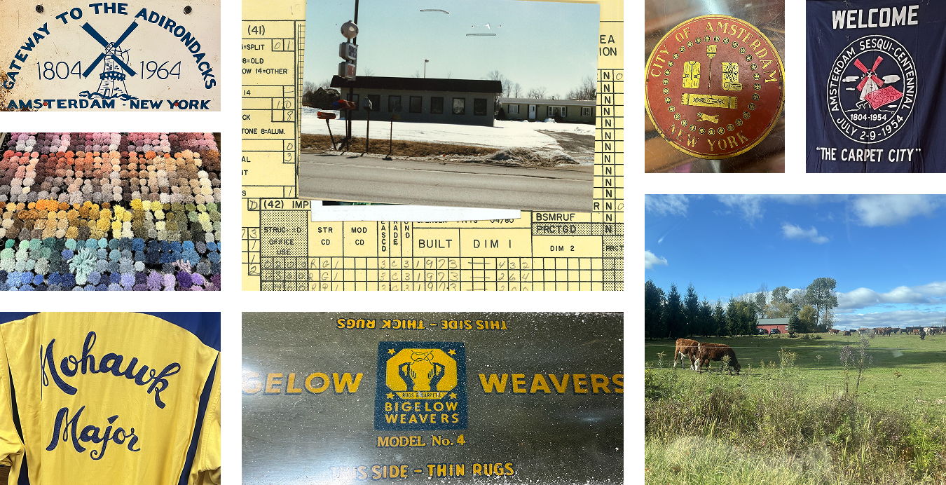
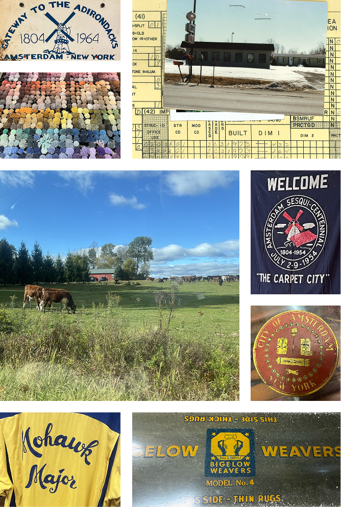
INSPIRATION FROM THE CITY OF AMSTERDAM
As part of our research, we visited the City of Amsterdam, its local museum, and the surrounding towns to do a deep dive into the area's history and culture. The images shown are of historical artifacts and the scenery in Amsterdam, NY, as well as the drive-in's previous signage used as inspiration for our new destination.
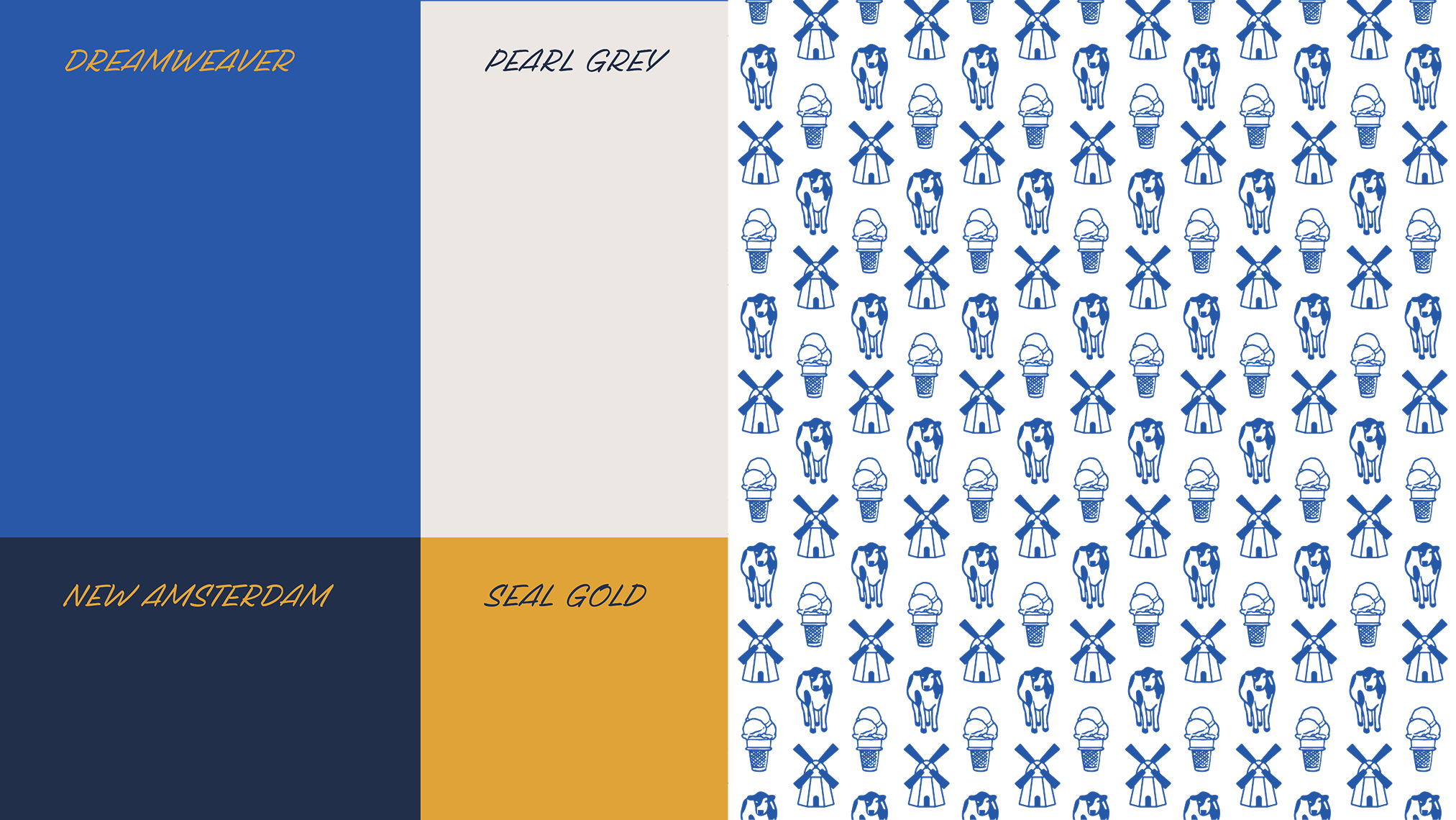
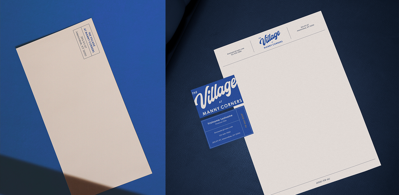
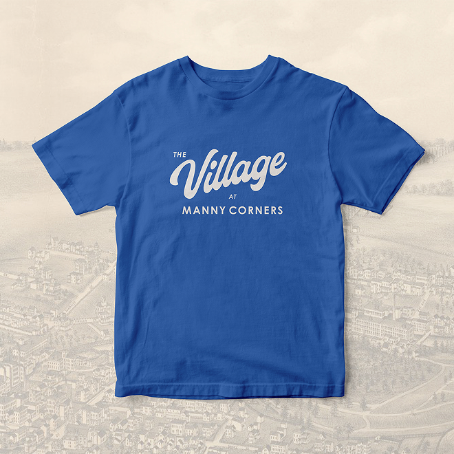

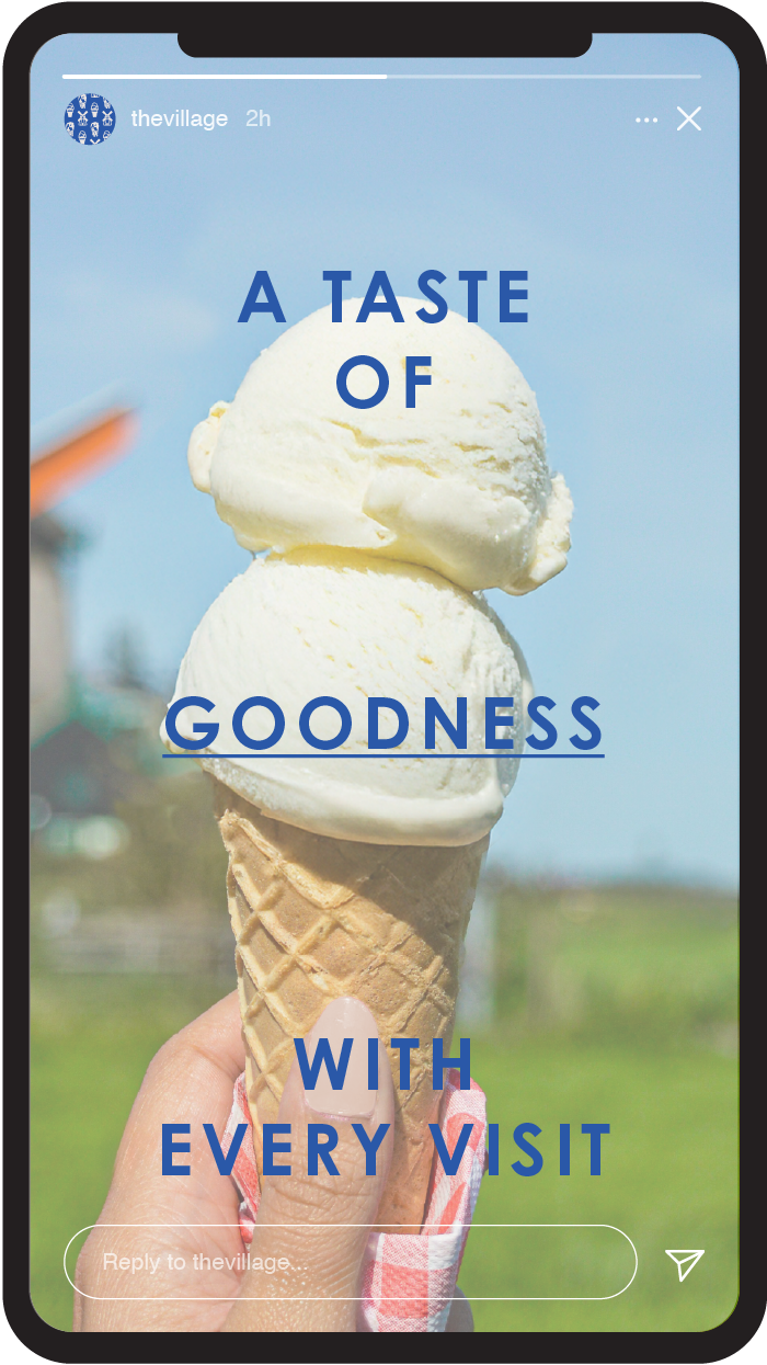
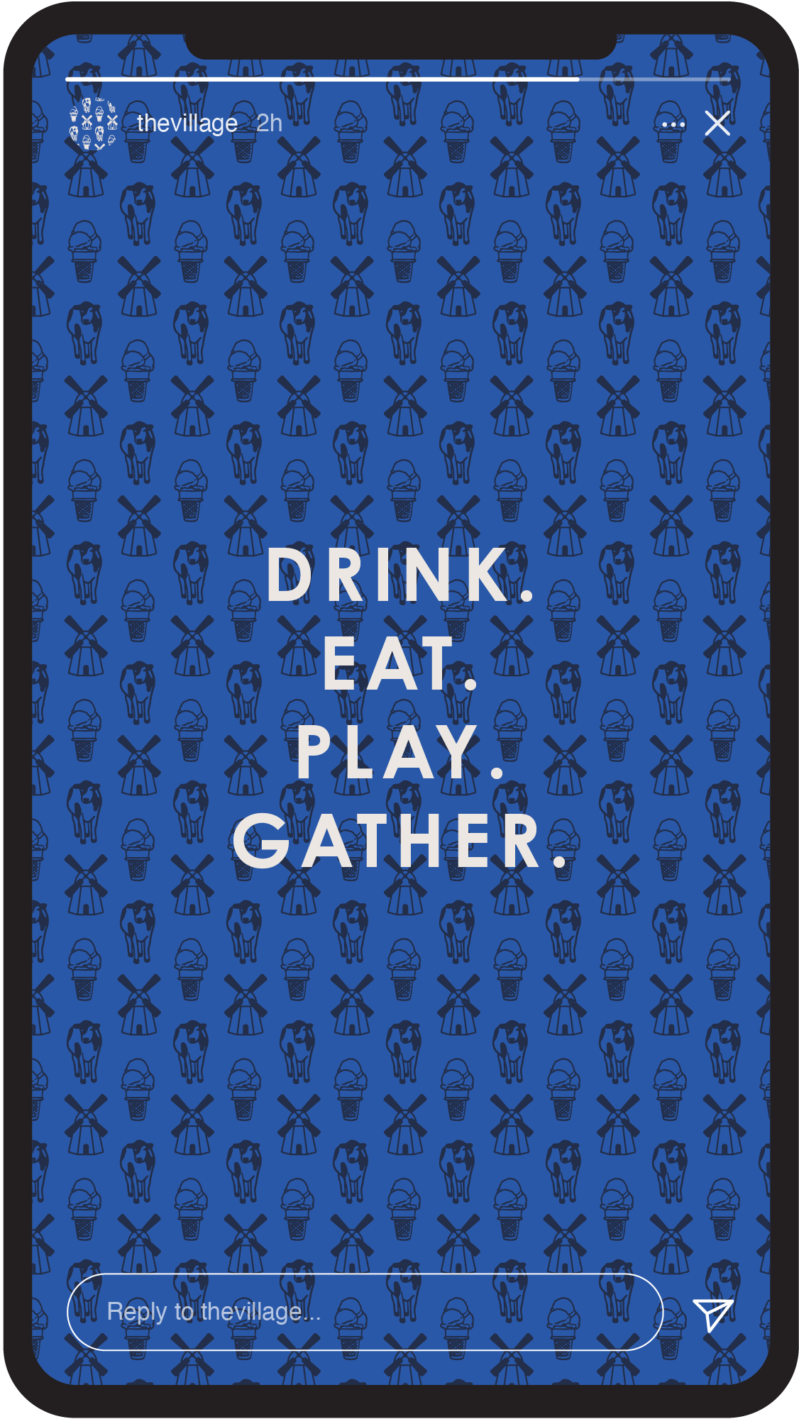
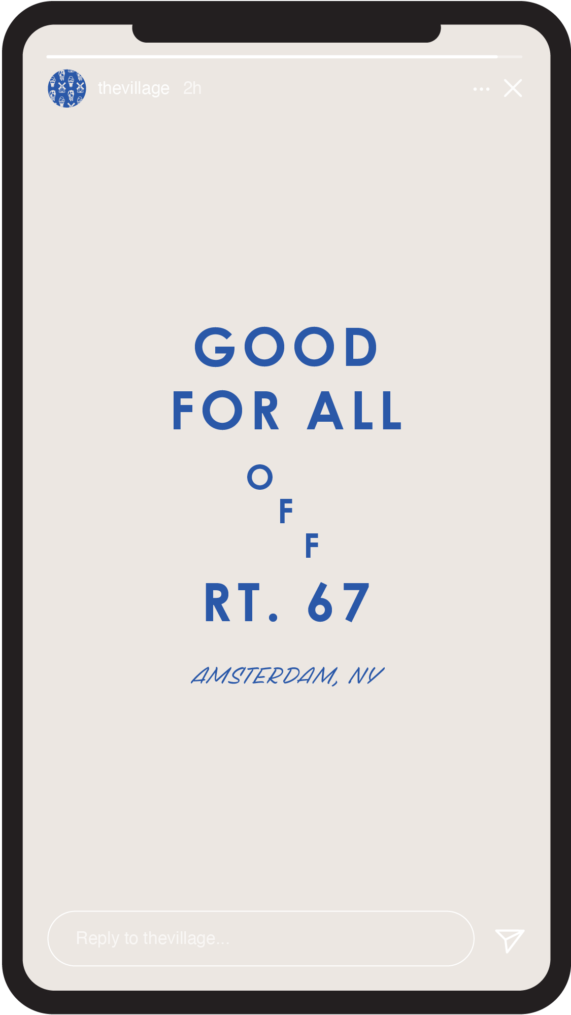
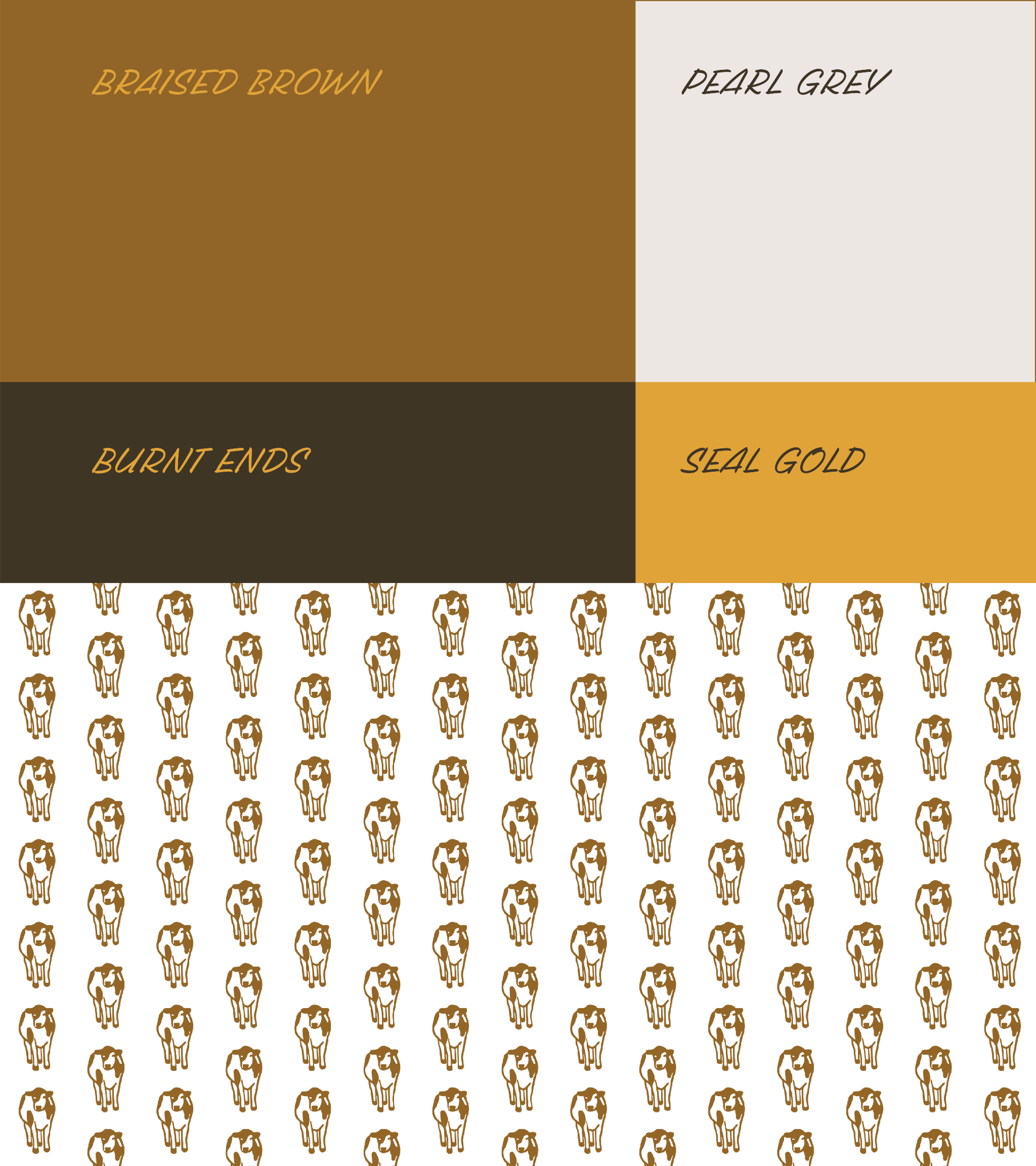
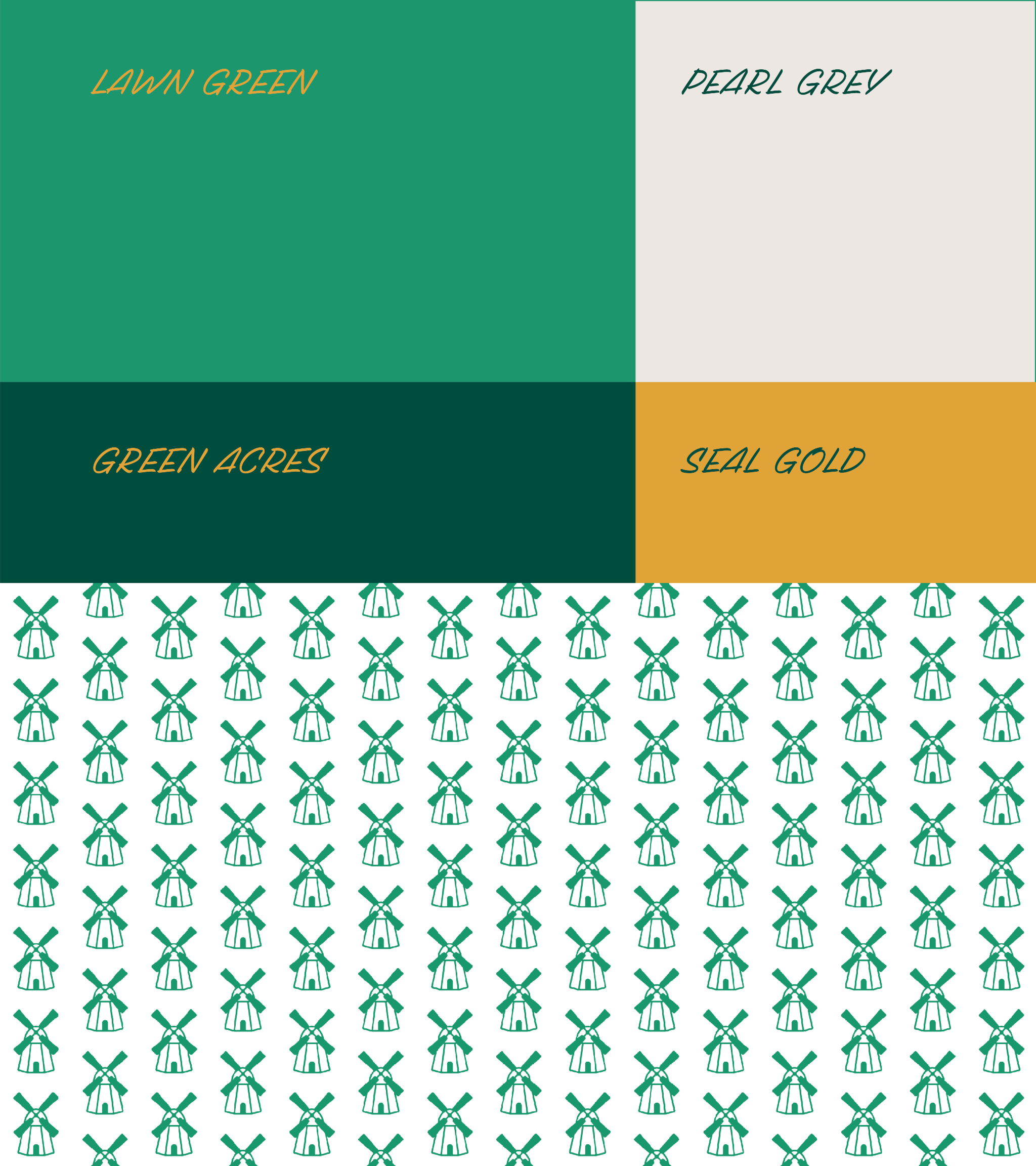
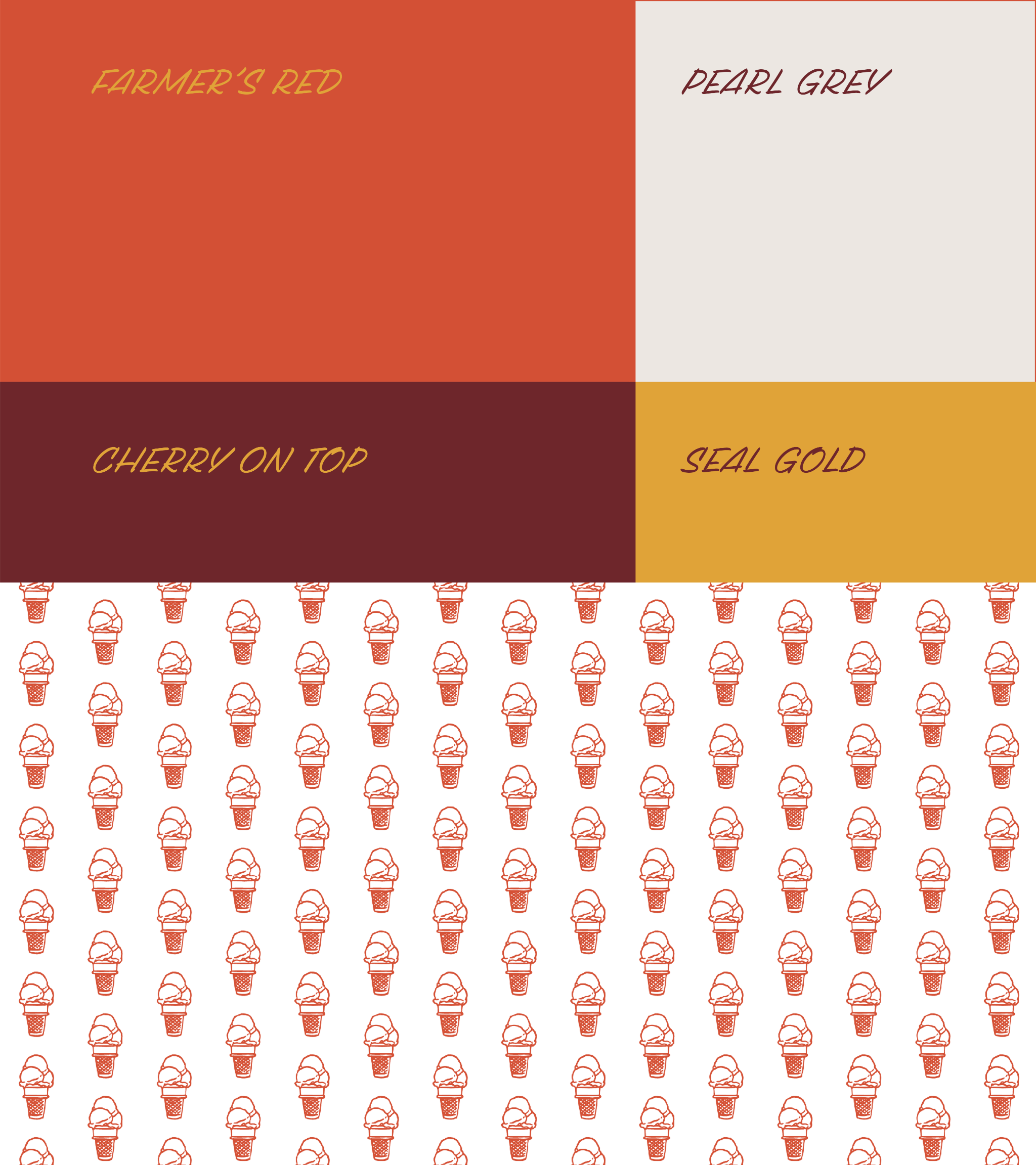
The Village needed a system for its current and future sub-brands that could grow along with it. Each sub-brand must be one word that replaces the "Village" in the primary wordmark with the addition of an illustrated icon. This icon can also be used in collateral as a pattern, with the potential to be added to the primary brand pattern. Each sub-brand has its own color palette featuring a primary and secondary color, accompanied by Pearl Grey and Seal Gold.
