Che Vita
FOR HILTON
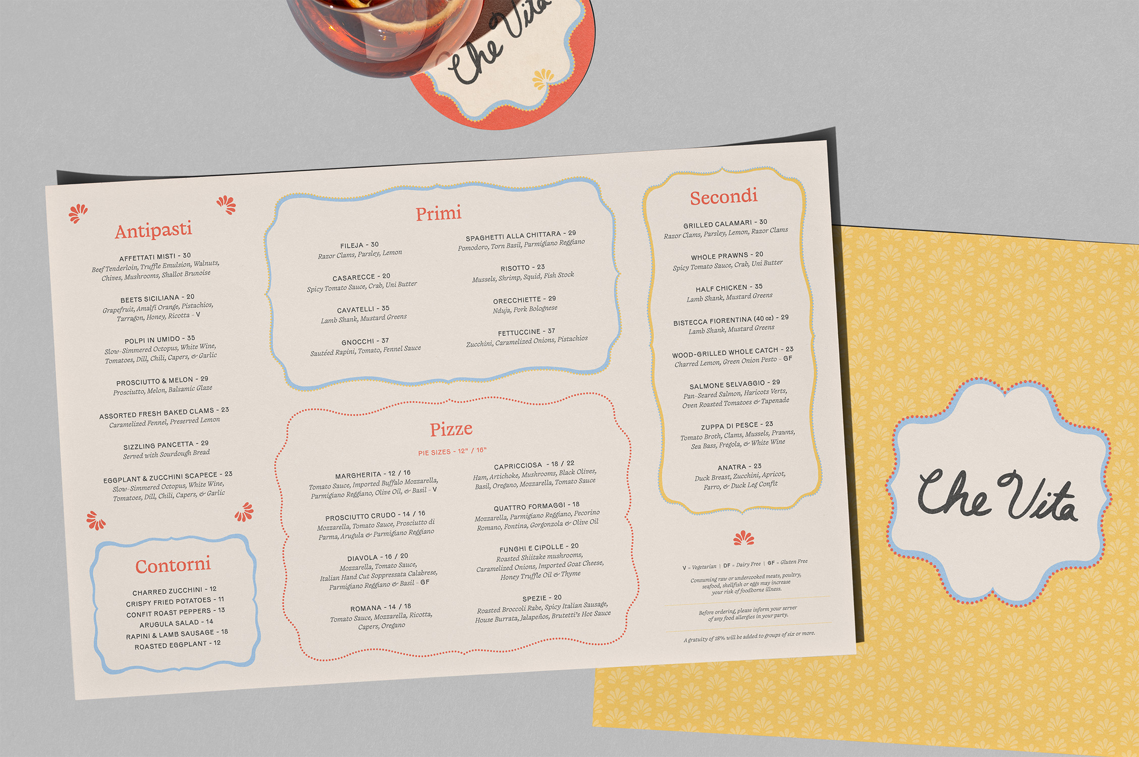
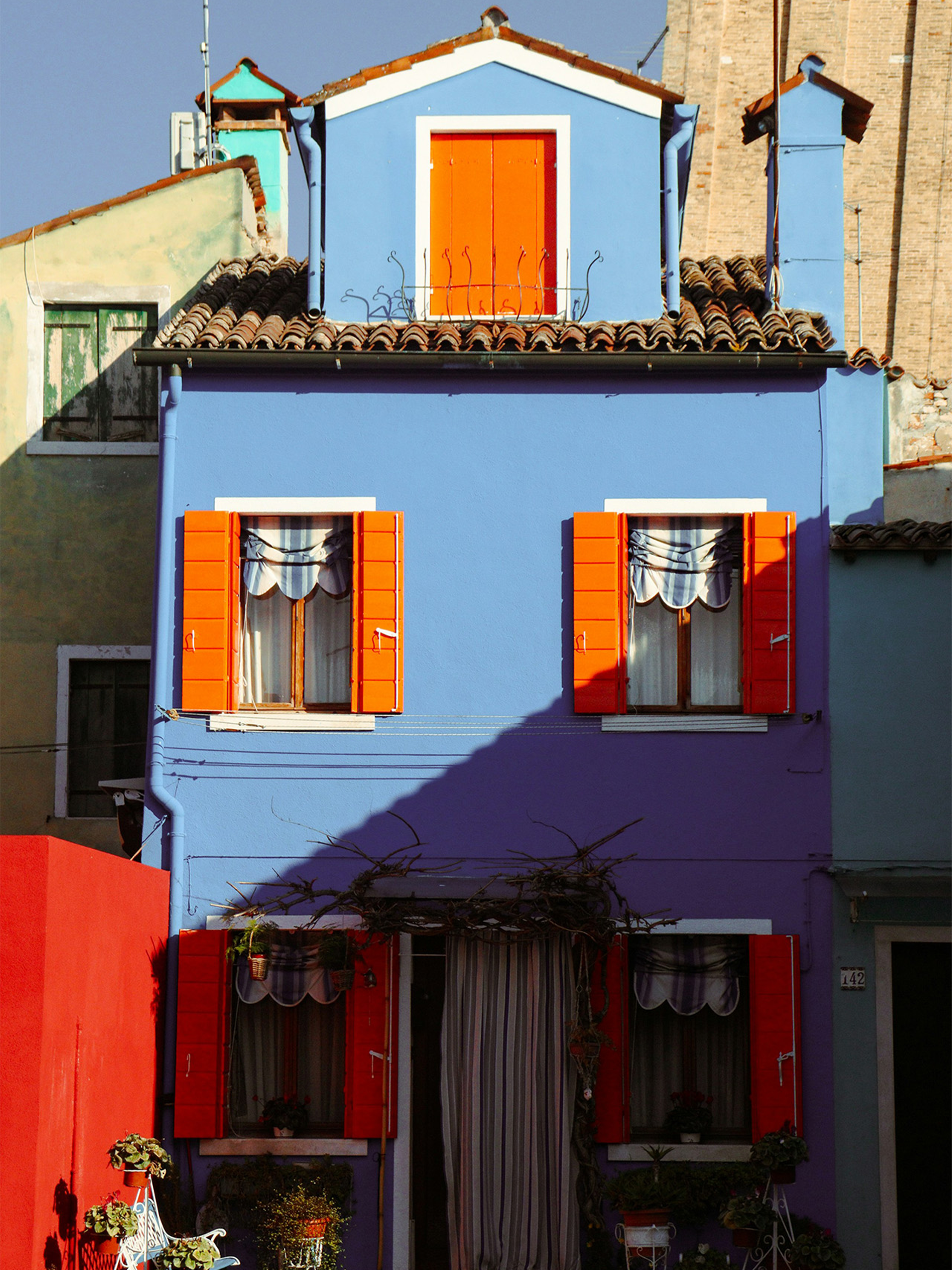
Hilton came to us with a Southern Italian concept in need of a name and visual identity. Inspired by La Dolce Vita through the photography of Slim Aarons and the iconic plateware of Vincenzo Solimene, La Ceramica Artistica Solimene, Che Vita was born. Che Vita or "what a life" is a sentiment as expressive as the menu — full of vibrant vegetables, seafood, and authentic Mezzogiorno dishes.
COLLABORATORS
Role: Lead Designer
Studio: MA’AM
Creative Director: Kristina C. Unker
Design Director: Sanja Planinic
Designer: Jessica Cullen
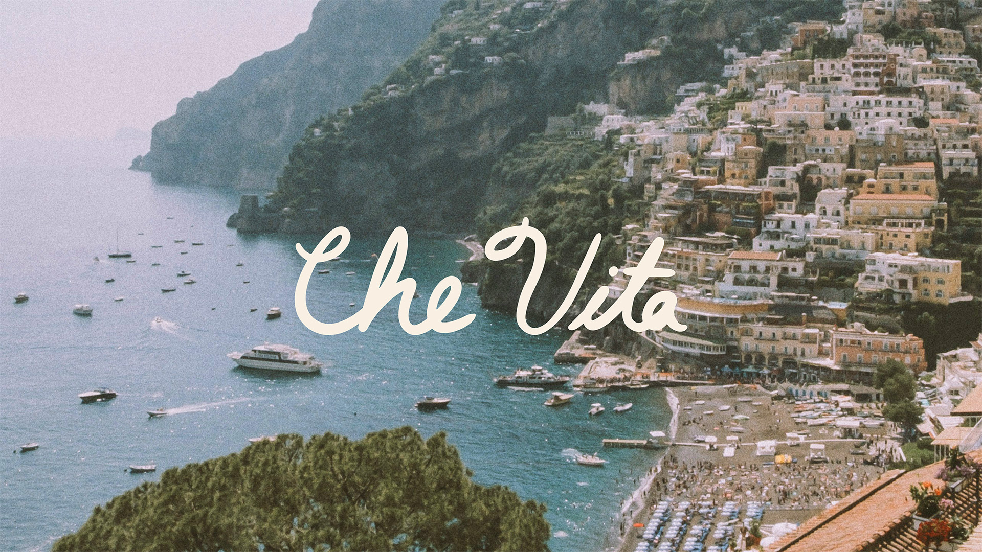
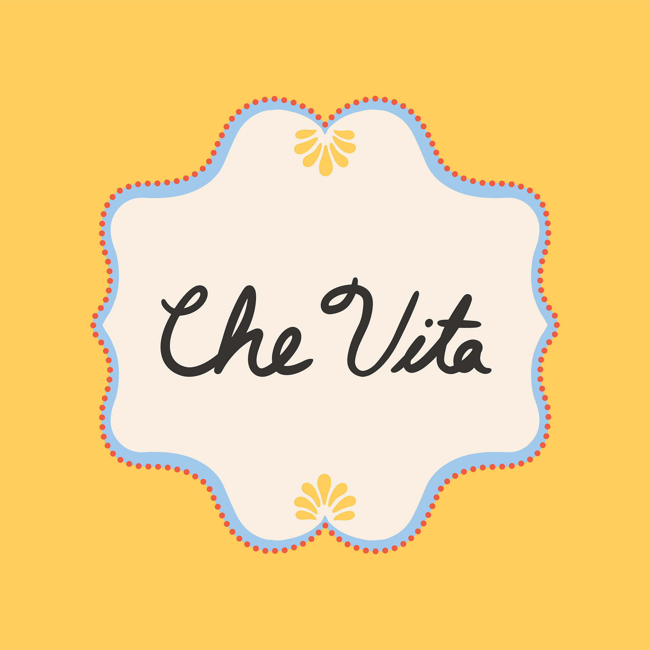
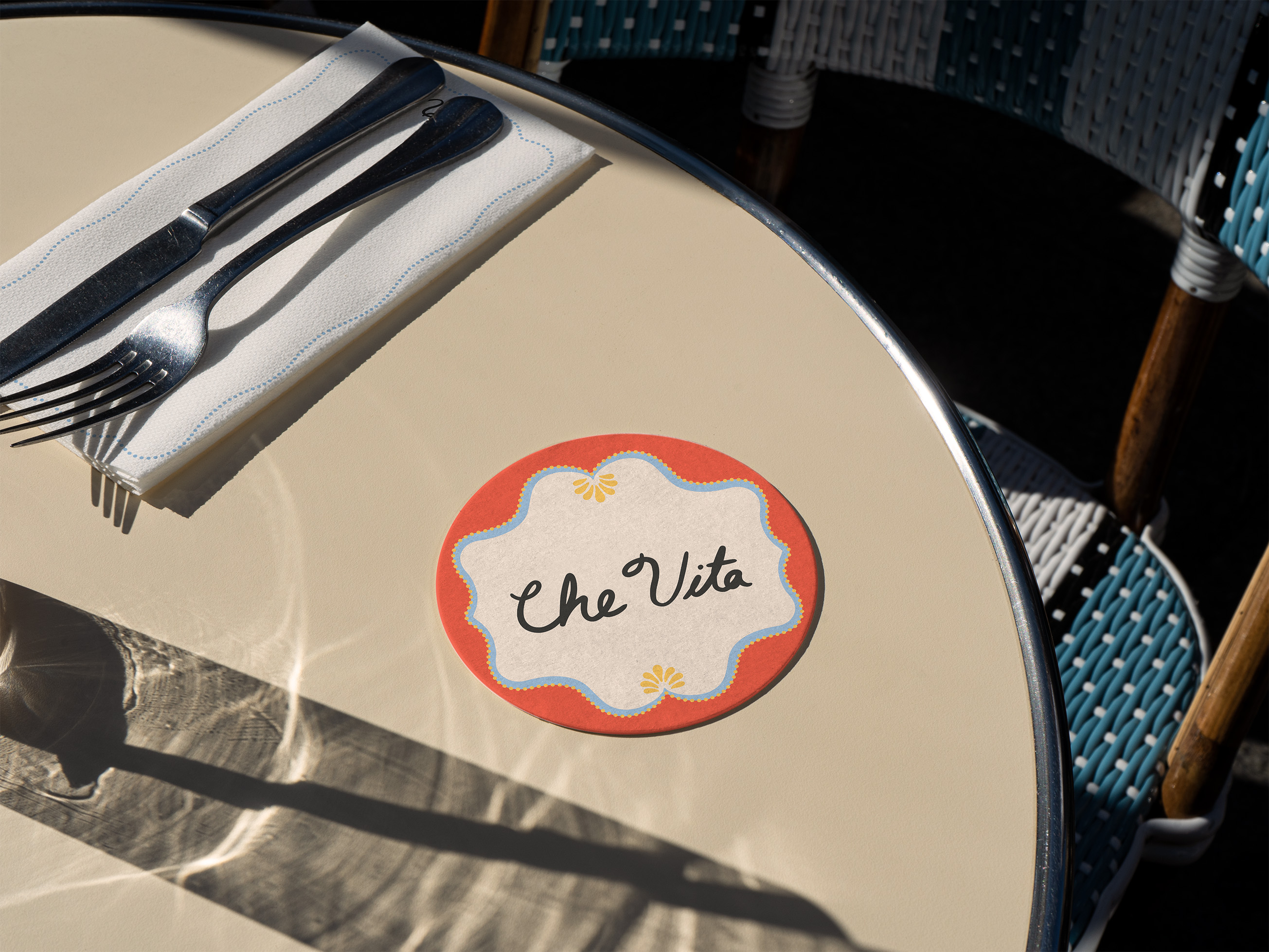
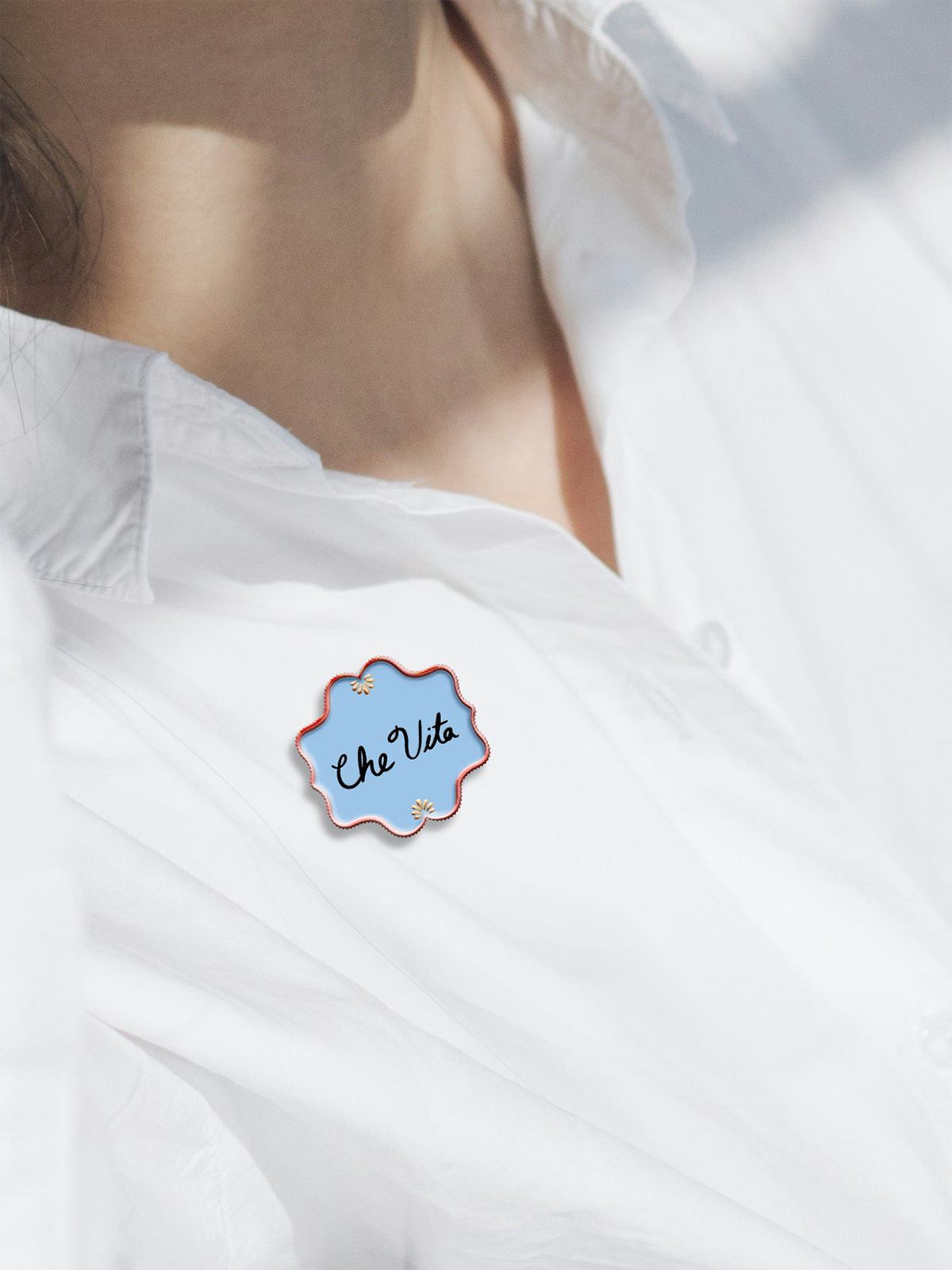
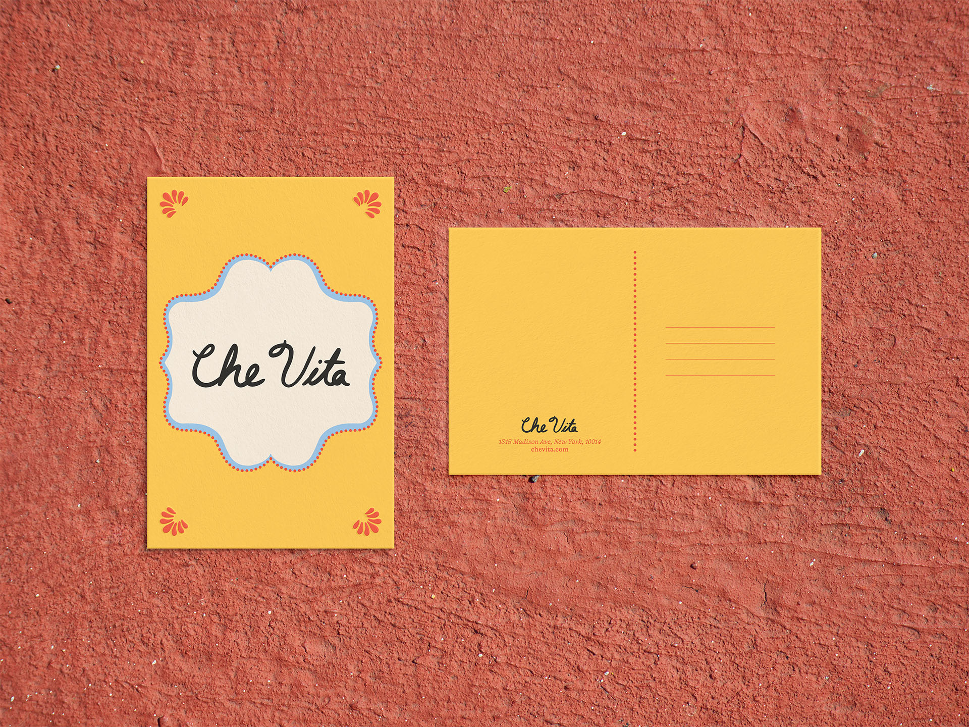
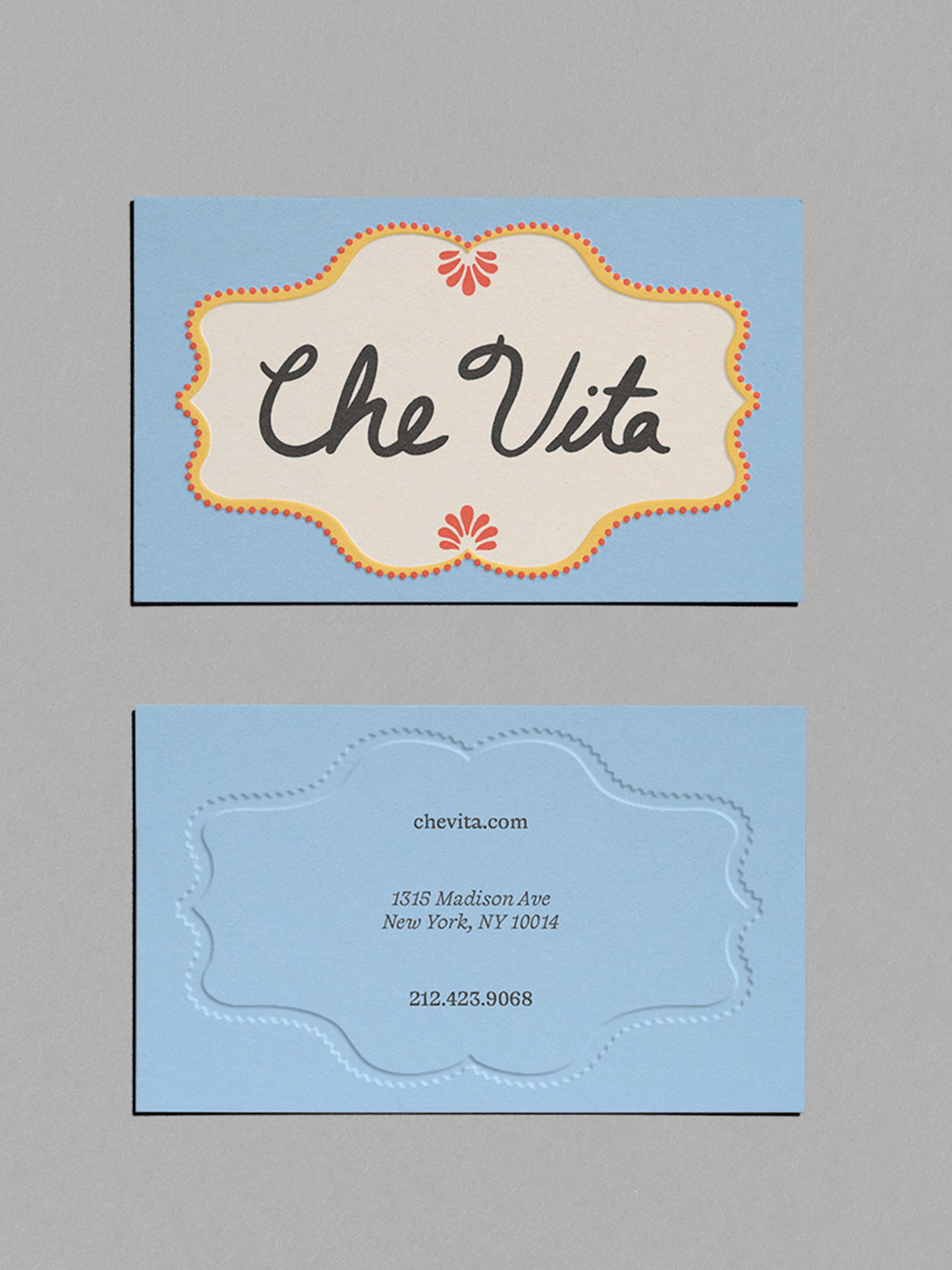
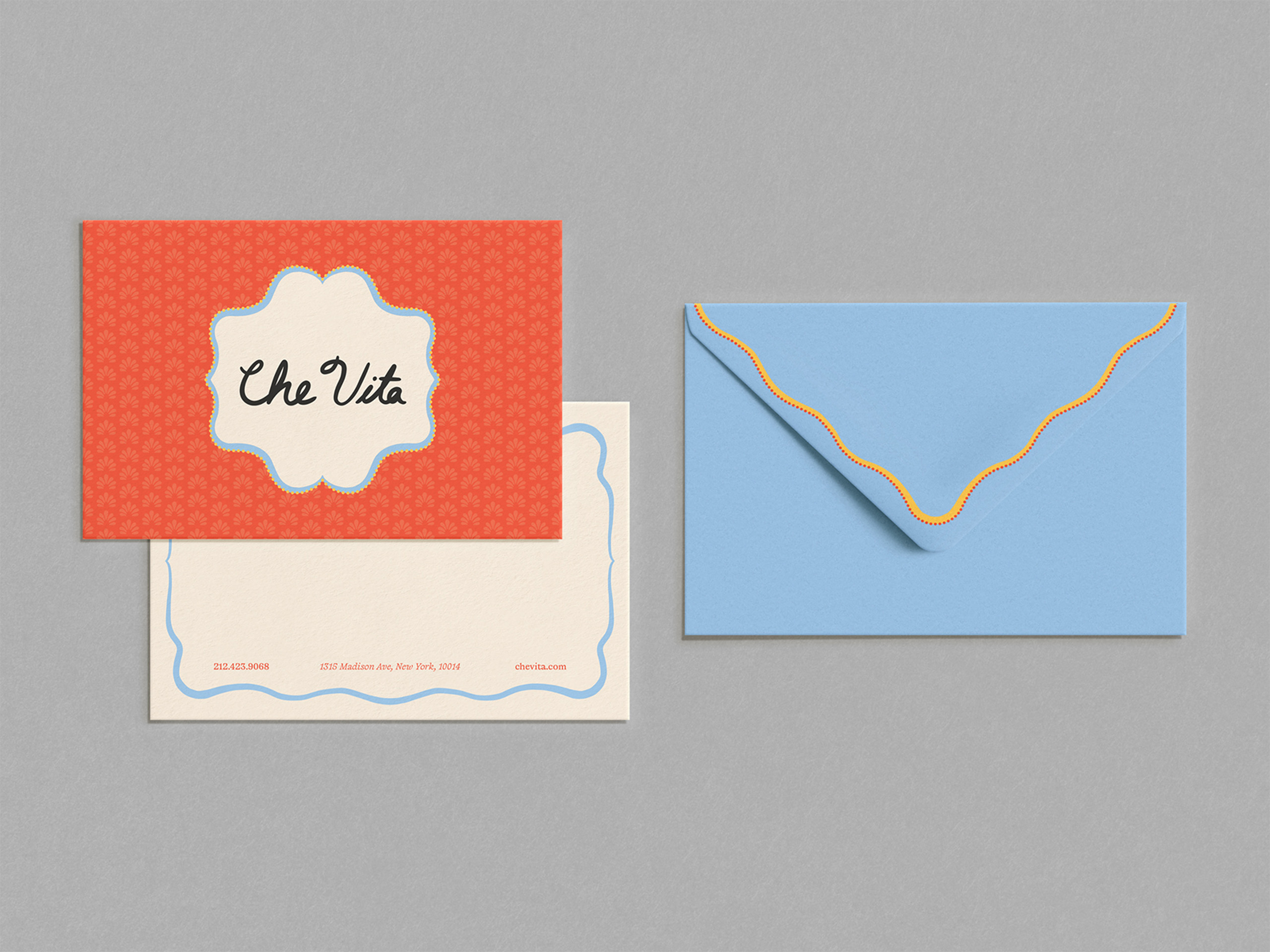
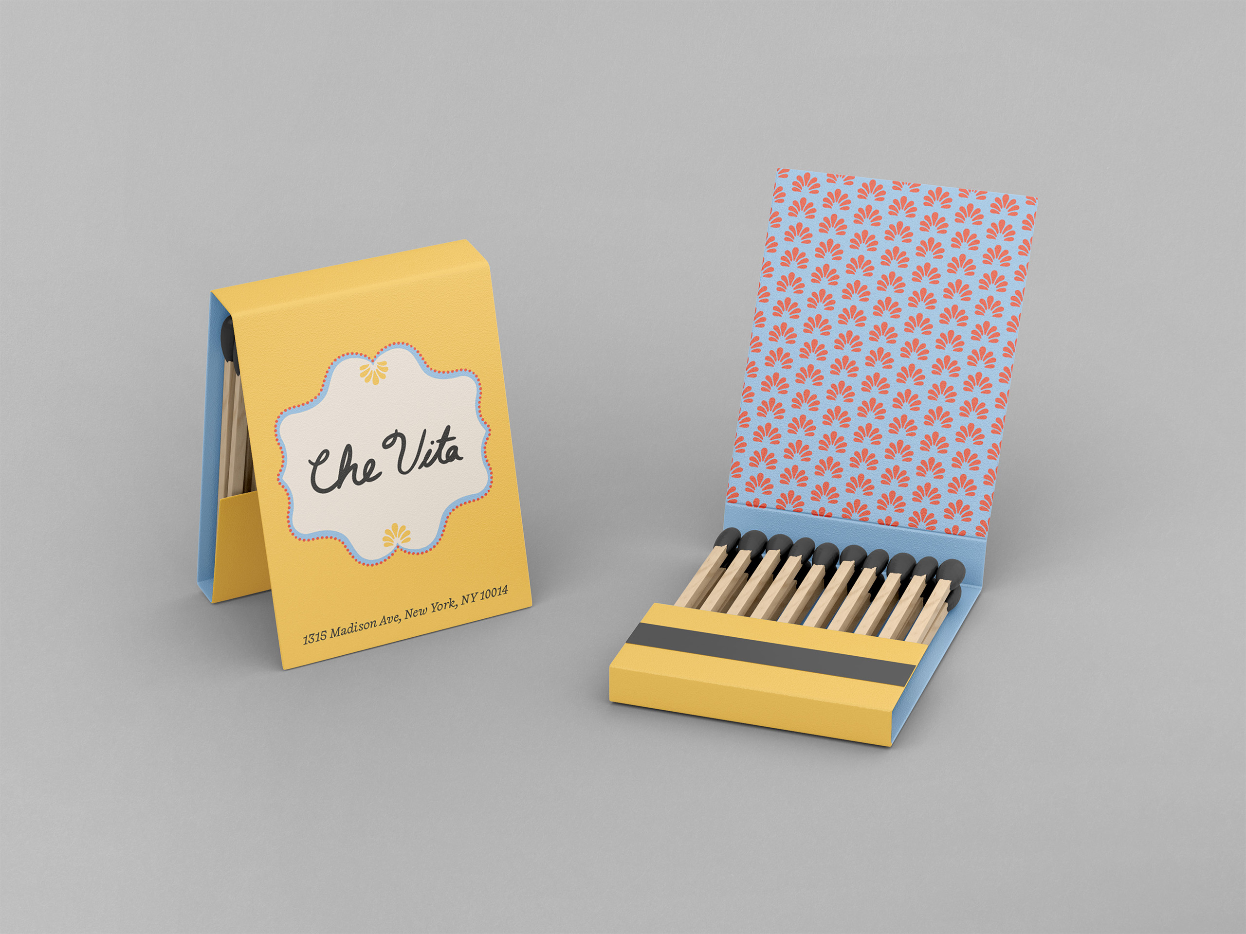
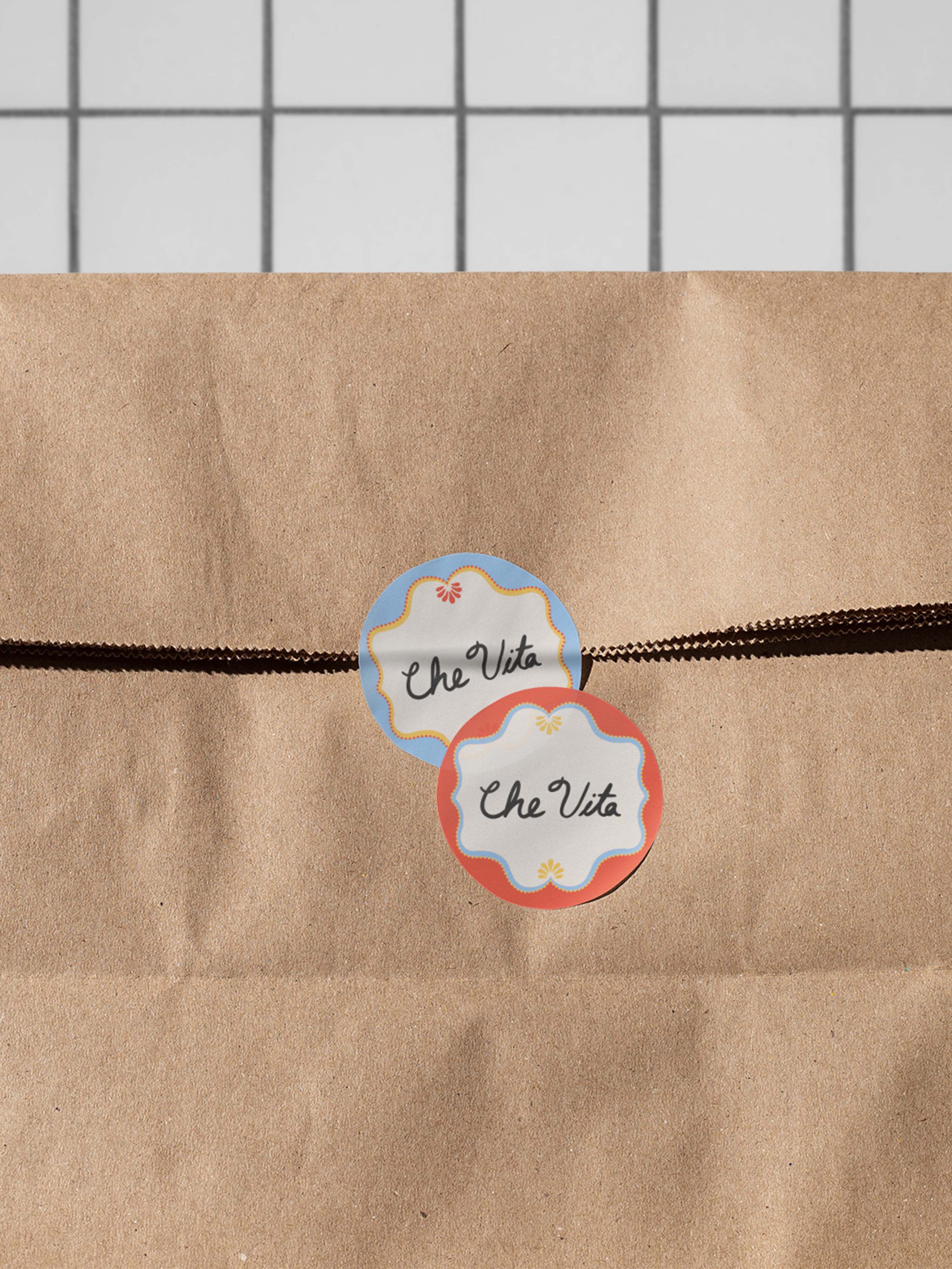
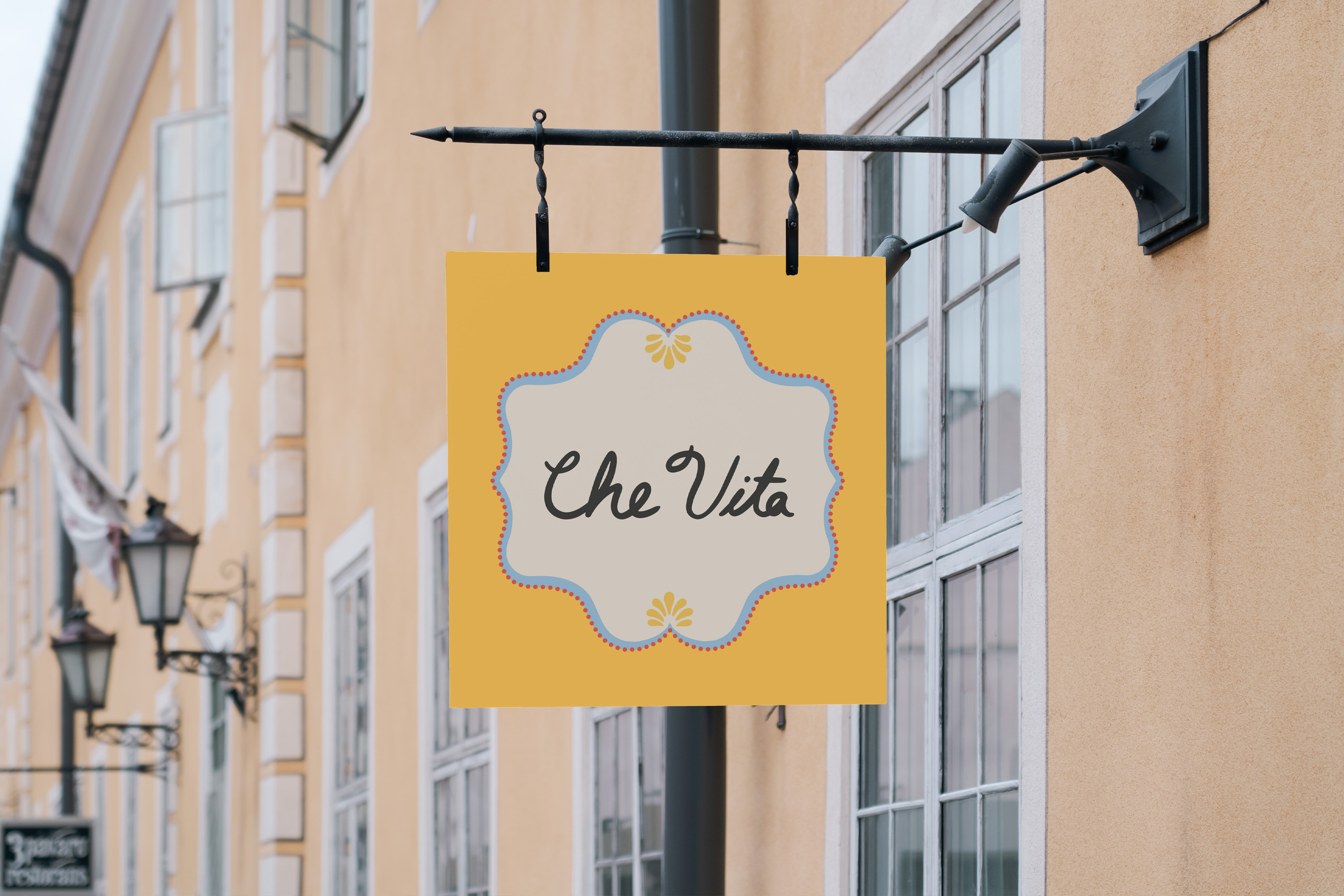
The hand-drawn logo and borders were inspired by the hand-painted signs of southern Italy and telegraph the artisanal nature of coastal fare.
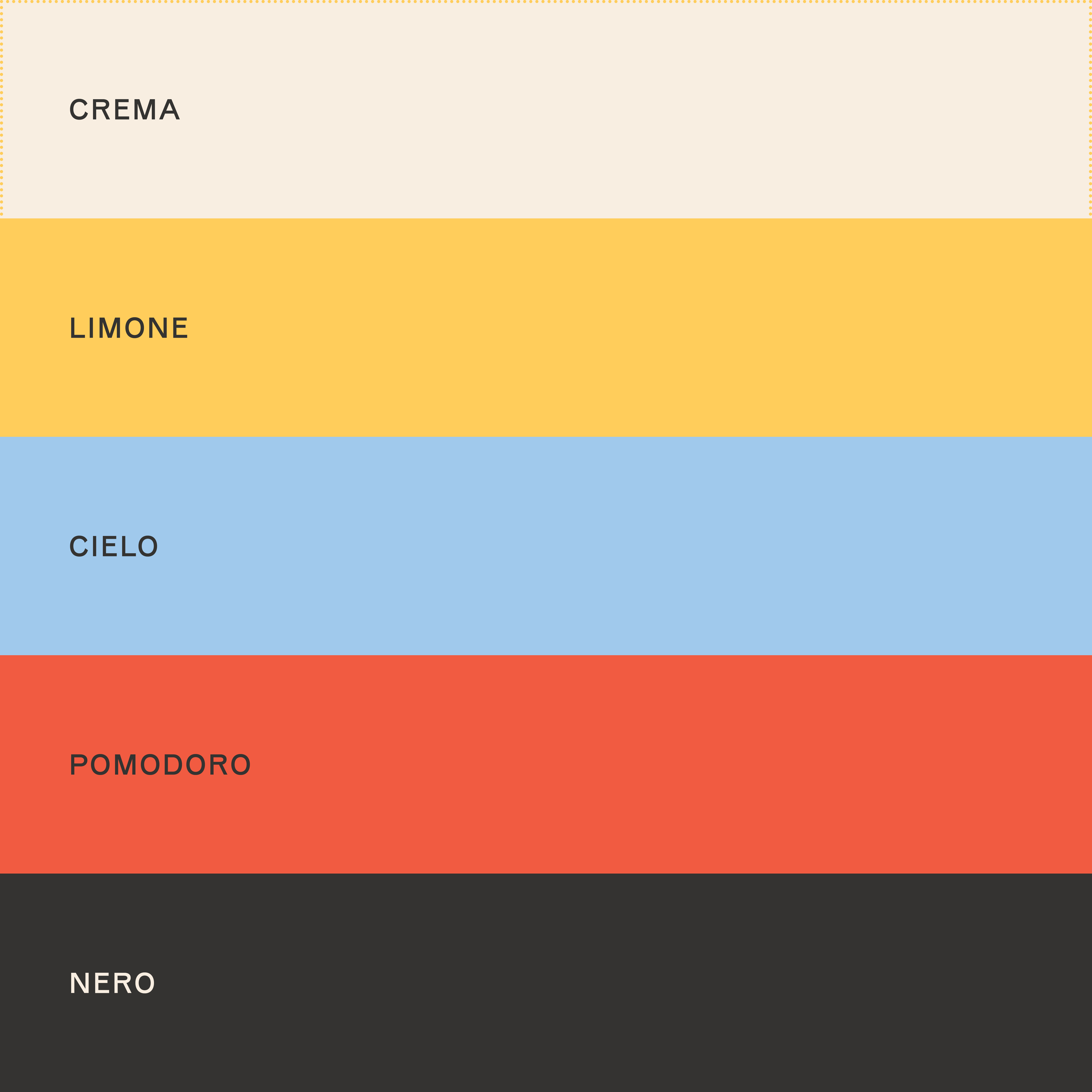
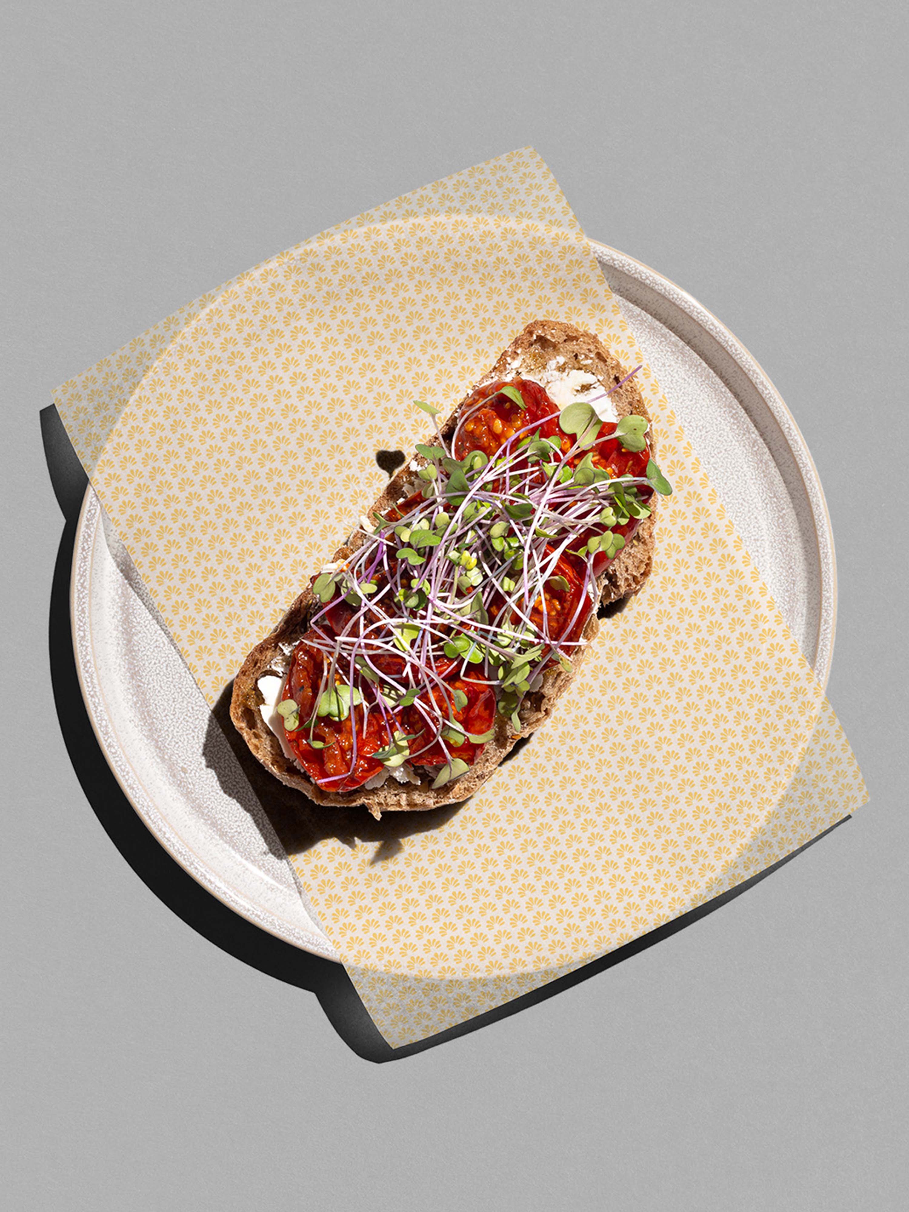
A bright and colorful palette gives the identity whimsy and flexibility.

CREDITS
Typefaces: Capraia by CAST Type Foundry & Isola by Luzi Type